Living at the intersection of
Design & Code

I like the messy middle and reshaping the way we approach the problem:

β‘  presenting research that contradicts the belief held by the project team
β‘‘ sharing unpolished explorations before they're "ready" to gather early stakeholder feedback
β‘’ putting fully interactive prototypes built in code in front of real users
β‘£ pushing back on technical decisions when I understand the tradeoff (which I usually do)
β‘€ owning the last 10% of polish that takes a UI from 90% to actually done

You may think, wow, Data & AI Platform experience, huh? But truth be told, I never really aimed to go into data or AI. But I've been living inside the industry trends as they happened: the delivery crunch, the hype cycles, the stress of figuring out what's actually worth building versus what just sounds good in a press release. What do we ship now, what do we cut, what genuinely helps our users get their hands on something new versus what's just us chasing the wave. I shipped through all of it, and I want to help a team to name what's worth working towards.

4 yrs
AI platform design
AI Workbench Β· GenOS Β· agent tooling Β· prompt systems
4 yrs
Data infrastructure dev-sign
Pipeline authoring Β· data lineage Β· observability tools
8 yrs
At Intuit
Engineering β†’ design, same platform expertise
10k+
Monthly active users
Across platform products I've contributed to
01

Design Engineering

The time for handing off a spec and hoping is so over. I can just open the PR and be done with it.

02

Prototyping in Code

Real, interactive prototypes built in hours, not days, hosted links I put in front of users, not clickthrough Figma. Validate the idea before full implementation.

03

Front-end Craft

TypeScript, React, CSS, animation. An eye for the details and the patience to own the last 10% β€” the 90%-to-100% that separates shipped from polished.

04

Complex UX & Systems

Turning dense technical workflows into clear, information-rich UIs β€” and the reusable component libraries that let a team ship them faster.

05

Beyond the UI

Not every dev tool needs a web UI. Sometimes the right answer is a CLI, an IDE plugin, or no UI at all β€” i'll design whichever surface engineers actually live in.

Build with

Code
TypeScript/React Java/Springboot Storybook Git/CICD operations
Design
Figma Design systems Prototyping User research
AI
Claude Code Cursor AI Assisted Research
Aug 2024 β€” Present 1 yr 11 mos

Staff Product Designer Β· Intuit

Leading the full development lifecycle workflows across Intuit AI Platform including Agent, prompt, and skills development, RAG pipeline management, and evaluation feedback.

  • Conceived and coded the prototype for a plugin that streamlines agent setup process; pitched it to PM, eng director, and it shipped as a live capability plugin β€” see case study 01.
  • Led Prompt Playground designs and authored the research-backed consolidation plan that folded a redundant 10k-user product into the platform and doubled adoption β€” see case study 02.
  • Continue to lead the org-wide design systems effort to design, spec, and ship 6 (and counting!) components and reusable patterns to the Design System β€” see case study 03.
  • Championed "designers as builders": authored a skill to keep future AI-assisted code on-system and a guide that took the design team to 100% AI prototyping adoption β€” see case study 04.
  • Designed the E2E Agent Skills experience to discover, bundle, consume them β€” see case study 05.
Nov 2022 β€” Jul 2024 1 yr 9 mos

Senior Product Designer Β· Intuit

Lead designer on a self-serve AI/ML platform delivering a streamlined AI developer workflow that includes self-serve no-code model development, GenAI application development with prompts, evaluations and guardrails, and Intuit's Generative AI portal that enables workers to learn, engage, experiment, and productionize GenAI capabilities within Intuit products.

  • Led the org wide design systems effort to create a component library on Figma and React.
  • Streamlined the approval process for Generative AI applications by platformizing metric evaluation suites against legal and security requirements.
Aug 2021 β€” Oct 2022 1 yr 3 mos

Senior Software Engineer Β· Intuit

Worked on decoupling the monolithic Data Pipeline Authoring and Observability Platform to a modern MSaaS architecture with proper documentations and end to end testing with Cypress.

Aug 2018 β€” Jul 2021 3 yrs

Software Engineer I~II Β· Intuit Data Platform

Worked on Data Pipeline Authoring and Observability features on the Data Platform that enables data accuracy, availability, and lineage discoverability. Lead the design & implementation of a team React Component library & take point on prototyping the future state of the product.

  • Install PR templates and checks in the team repo to ensure a faster review cycle (there was none before!)
  • Regularly interview customers to identify important features to develop and improve
  • Full-stack across UX/UI (Figma, Sketch, React), backend RESTful services (Scala, Java), database (MySQL, Slick, Elasticsearch), and DevOps (Jenkins, AWS S3/EC2).
Grinnell College Iowa

Bachelor of Arts

Computer Science and Theatre & Dance*, concentration in Linguistics.

*yes, really. theatre. spent years stage managing β€” coordinating cast, crew, directors, and designers with no authority over any of them turned out to be most of what being a designer is. i didn't expect that.

01 β€” Research, Strategy & Prototyping

Agent Development Workflow

From "why is nobody using this?" to "what if we didn't need a UI at all?"

Lead Designer, Researcher, Prototype Developer Journey mapping Β· Behavioral segmentation 58 survey responses Coded prototype Β· Shipped as Day-0 Agent Setup
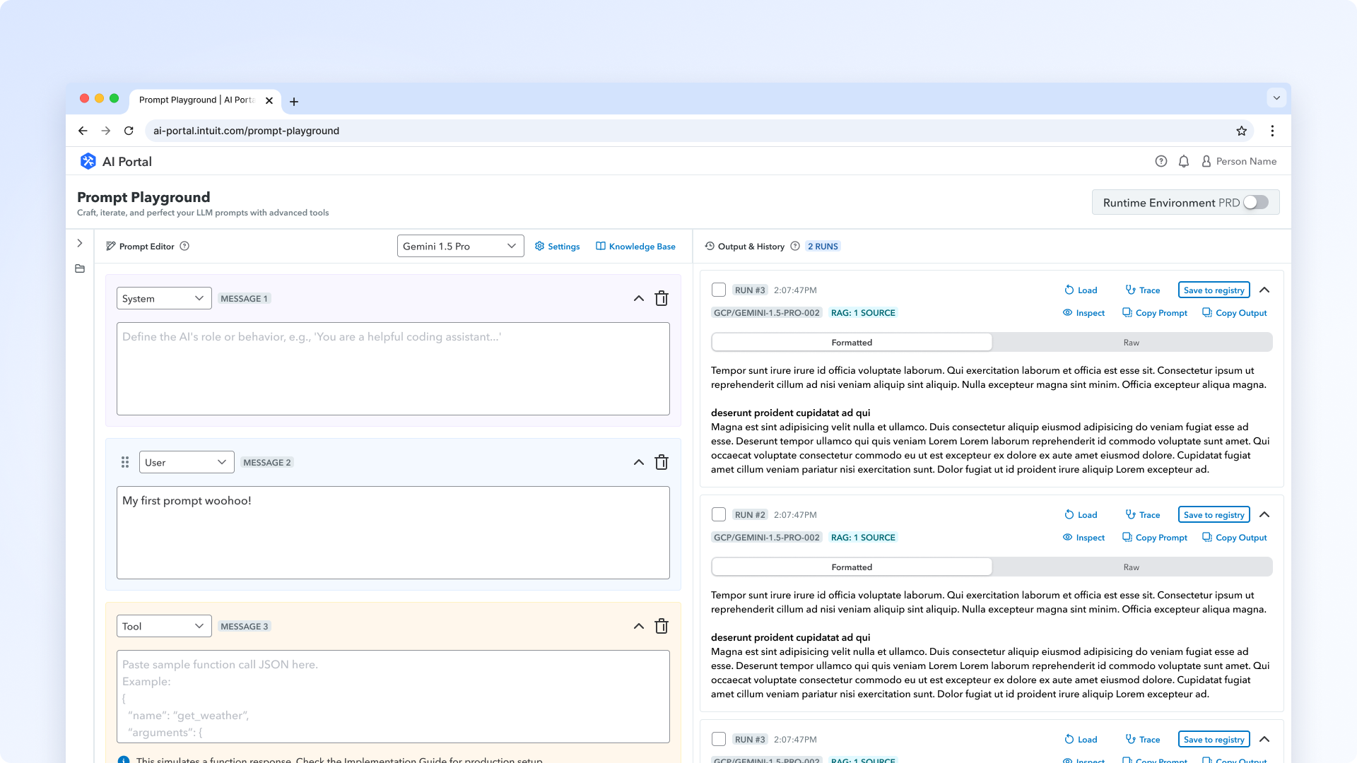
Prompt Playground UI

Part 1 β€” The Research

The Problem

Features existed. But for whom?

The AI development platform covered everything β€” model discovery, prompt engineering, RAG pipelines, LLM evaluation, fine tuning, agent development, production deployment. However, engineers who should have been power users of the platform were churning after a single session. The prevailing assumption on the team was that we had a feature gap and we needed to add more features to attract more users.

I wasn't sure that was quite right.

The Approach

Segment first, then ask.

With the help of the team's analyst, we pulled the list of users who have used the more than 3 features of the product in the last 60 days. Then, I wrote a Python script to segment the split 1,474 users into behavioral cohorts based on usage breadth, frequency, and recency. Each cohort got its own survey, because the question you ask a power user is not the question you ask someone who churned.

I collected 58 responses, with the largest cohorts being Lapsed and Burst β€” exactly where understanding churn mattered most.

Four behavioral cohorts, each surveyed for a different reason.
Segment Behavior Why survey them
Power High breadth and frequency, active recently Understand advanced workflows and what keeps them coming back
Veteran Meaningful, repeated usage, but not quite power-user levels Understand mainstream workflows and what's "fine but not amazing"
Burst Sampled the product heavily but didn't return Understand early abandonment, usability blockers, expectation gaps
Lapsed Meaningful activity once, then stopped coming back Understand why they left and what changed
1,474
Users segmented via custom Python analytics script
58
Survey responses across 4 behavioral cohorts
Analysis doc
Circulated among dev and PM managers & directors to inform platform direction

What We Found

The cow tools problem.

A Far Side cartoon shows a cow displaying a set of tools it made. They're bizarre and useless β€” because a cow has no idea what a human actually needs. The joke is that the maker and the user are so misaligned that the output is incomprehensible. That was AI Workbench. The platform was built by engineers who understood the infrastructure deeply, but hadn't sufficiently understood how the people using it actually worked β€” what they were trying to accomplish, where they got stuck, what "done" looked like to them. The result was a set of tools that made sense from the inside but baffled people on the outside.

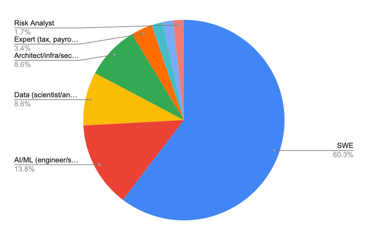
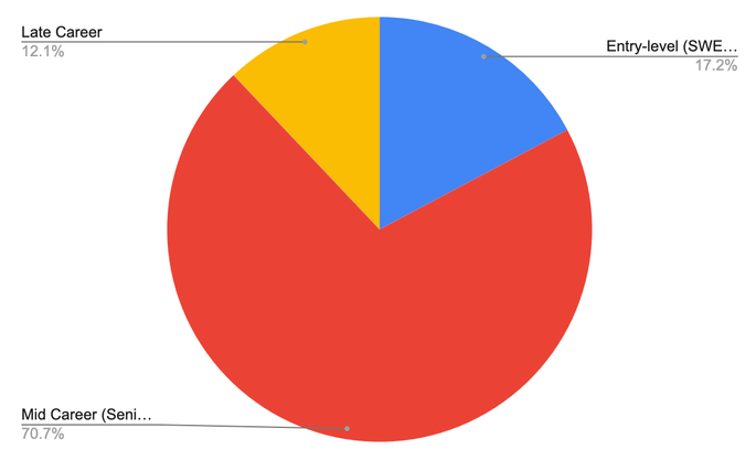
I discovered that over 90% of churned users were hands-on engineers and AI/ML scientists, unlike the main assumption that our metrics were underperforming due to non-technical users abandoning our technically geared product. One more cut mattered: 71% of respondents were mid-career, meaning that they already know their trade, they have strong tool preferences, and expect quick ROI inside a sprint, not sometime in the future. These users were workers in the middle of working on a deliverable, with tight timelines and high expectations. When that group comments that a tool is "hard to understand," they usually don't mean they can't figure out what it's for; they mean it didn't justify the time it took to figure out.

Respondent role breakdown: 60% SWE, ~90% technical roles overall
Respondent seniority breakdown: 71% mid-career

The people churning were exactly who the platform was for β€” ~90% technical, 71% mid-career. Not the wrong audience.

With the audience fit ruled out, the tempting conclusion was a usability problem: the UI is confusing, the docs are thin, let's clean it up. But before accepting that conclusion, I wanted to dive deeper into what our churned users were saying.

First: This bucket is the largest driver of drop-off from our users with 10 mentions from burst and lapsed users, and describes the same underlying sentiment: the value proposition was not strong or clear enough immediately to justify continued use.

"What do you want me to use it for? I don't understand outside of setting up prompts."

β€” Lapsed user, mid-career staff engineer

This response from a user stood out to me the most. Here was a capable engineer, asking us to just show them the point of our product. Every version of the drop-off traces back to that one unanswered question.

Second: This issue caused dropoff even before the users can reach value: Without an easy way to learn more about the product and its value, users did not return to the product after their initial evaluation of the features. In some cases, this lack of clarity made external tools with more discoverable documentation and learning resources a more attractive alternative.

β€œMost internal tools are hard to adopt because we can't use external ai to help us figure out how to use them. The tools change constantly, which is fine, but the wiki pages never keep up. while i can learn any external library or tool quickly, i don't have that option for internal stuff. they just aren't ai-friendly yet. If i cannot use ai to learn of how to use it, most probably, i'll try to find other tool to use out of Intuit solution.”

β€” Burst user, mid-career staff engineer

These two points together reveal that the real problem is not technical capability or user sophistication. Value clarity was the root cause; the docs and usability friction only amplified it. Better external tools weren't the main reason people left; they were the default people fell back to once AI development platform's value wasn't immediately apparent, especially for newer Intuit employees.

Interestingly, one group didn't fit the pattern at all: our power users. They complained about the same friction the churned users did β€” same clunky setup, missing docs, and the steep curve. Yet, they stayed. So the question stopped being "why is the product hard?" and became "why did the same friction end some users and not others?"
The Forensic

What the power users actually had.

I worked backward through it. If the survivors weren't spared the friction, something else explained why they pushed through. I took the three obvious candidates and tested each against the data.

  • Was it time? No. We had 8-year veterans who churned and 1-to-3-year newcomers who became power users. Time buys tolerance for friction, but it doesn't create commitment.
  • Was it adopting before other tools existed? Early power users had fewer external AI tools to compare against, and were forced to experiment internally. However, the power users still complain about UX and friction. They stay because the value is clear, not because there are no alternatives. So external tools raise the bar, but they don’t explain why power users stayed.
  • Was it hands-on help β€” workshops, live demos, someone walking them through the first build? Surprisingly, yes! These support systems not only made the value clear, but also showed a successful path. A good demo is worth a thousand words β€” the users didn’t have to guess how to get started, and they were able to see the end-to-end success that reduced their early cognitive load that would have come with interpreting docs and reverse-engineering workflows. All these address the two biggest challenges.

The Insight

The product was quietly depending on human hand-holding to work at all.

Power users didn't win out on patience or talent. They persisted because a human held their hand across the exact gap where everyone else fell in. This showed that the white-glove support wasn't a nice-to-have this supposed "self-serve" tool; it was absolutely necessary to guarantee quick time-to-first-value.

"Had some struggle when I started using it, but now I can figure out pretty much everything by myself since I've got some practice."

β€” Power user, on how they made it through

This quote may seem like a cheesy success story at a glance, but it demonstrates that the user made it because they were willing to reach out to support and stick through. Most users not only do not owe us that patience, but also ended up churning simply because they couldn't stick through with a tool that did not seem like a quick value add to their workflow.

The team's first instinct was the obvious one: if people are getting stuck, write a more thorough documentation and guidebook. But the responses from our users had already ruled that out. The users who struggled most weren't the ones without docs; they were the ones reading them.

"It is REALLY difficult to create a RAG database and to get AI agents into production. Current documentation has cost our teams weeks of wasted time."

β€” Power user who stayed

Realistically, more docs wouldn't have helped this user. The problem with documentation is that it drifts as the tool changes weekly. Even when it's current, it's written by the engineers who built the feature, describing what they made rather than what a user needs to do to get value out of it. It's the cow tools problem again, one layer down: the docs made sense from the inside and baffled everyone outside. You can't write your way out of a guidance problem with more of the same baffling guidance.

The other one-dimensional solution might be β€œWe should just do more training. ” This is not a scalable solution, unfortunately, as there will never be enough support engineers to personally walk every AI Builders at Intuit to their first win.

So the new direction wasn't "write better docs" or "run more workshops." It was: take the one thing the white-glove treatment did: guide someone to a working result before they give up, and encode it into the product experience itself, so every user gets that guided first run, not just the ones who happened to get a person.

Reflection

None of this insight was visible in the metrics: the dashboards showed us that people left, and roughly where. They could never have told us why the same friction was fatal for some users and survivable for others β€” that the difference wasn't the product at all, but whether anyone had guided them across the first gap. That answer only existed in the users' own words. The data killed each of the erroneous assumptions we were holding, and as a result of this research, dev managers started requesting user research before starting their planning cycles, not after. That hadn't happened before. Presenting findings in a way they could feel, not just read, was as important as the findings themselves. That's the part that changed how the team worked!

Part 2 β€” The Answer

After the research, I decided to go through the process myself.

During a hackathon week, I tried to build an agent from scratch. I'm a former software engineer, I'd worked on the agent starter kit, I knew the platform. I assumed it would be straightforward.

It wasn't. I cloned the wrong repo. The documentation sent me to three different surfaces in the wrong order. I spent time manually copying values between systems that clearly already knew about each other. I had to download a third-party API client just to send a test request. I dug through Slack to find workarounds other people had written. After a few hours of this, I was able to send a simple prompt, but that was about it.

If I couldn't get through it with all that context and documentation, the problem wasn't that users needed better documentation or a friendlier UI. The assumption that this whole workflow had to happen across multiple disconnected websites was the problem.

FigJam agent setup flow

Massive, massive flow just to send a prompt to the agent locally. You may not be able to see, but the evaluation documentation states that it will take 7-13 hours to complete the steps outlined in the documentation. DAUNTING!

The Reframe

What if developers never had to leave their terminal?

This ties to the problem of value proposition: if users had to jump through multiple documentation and tools to connect all the moving parts to simply send a prompt to the agent and get a response, they're going to abandon the poorly paved path and look for a better road. But even a well-executed version of the same approach would still require developers to leave their natural environment to configure things back and forth in a browser and an IDE.

As a former engineer, I also recognized the solution pattern. Developers work with their terminals, IDE, and now AI coding assistants. That's where they're fast and in context. Tools like create-react-app exist to collapse complex setup into a single command so developers can skip the scaffolding and get to the actual work. There was no reason agent development at Intuit couldn't follow the same model.

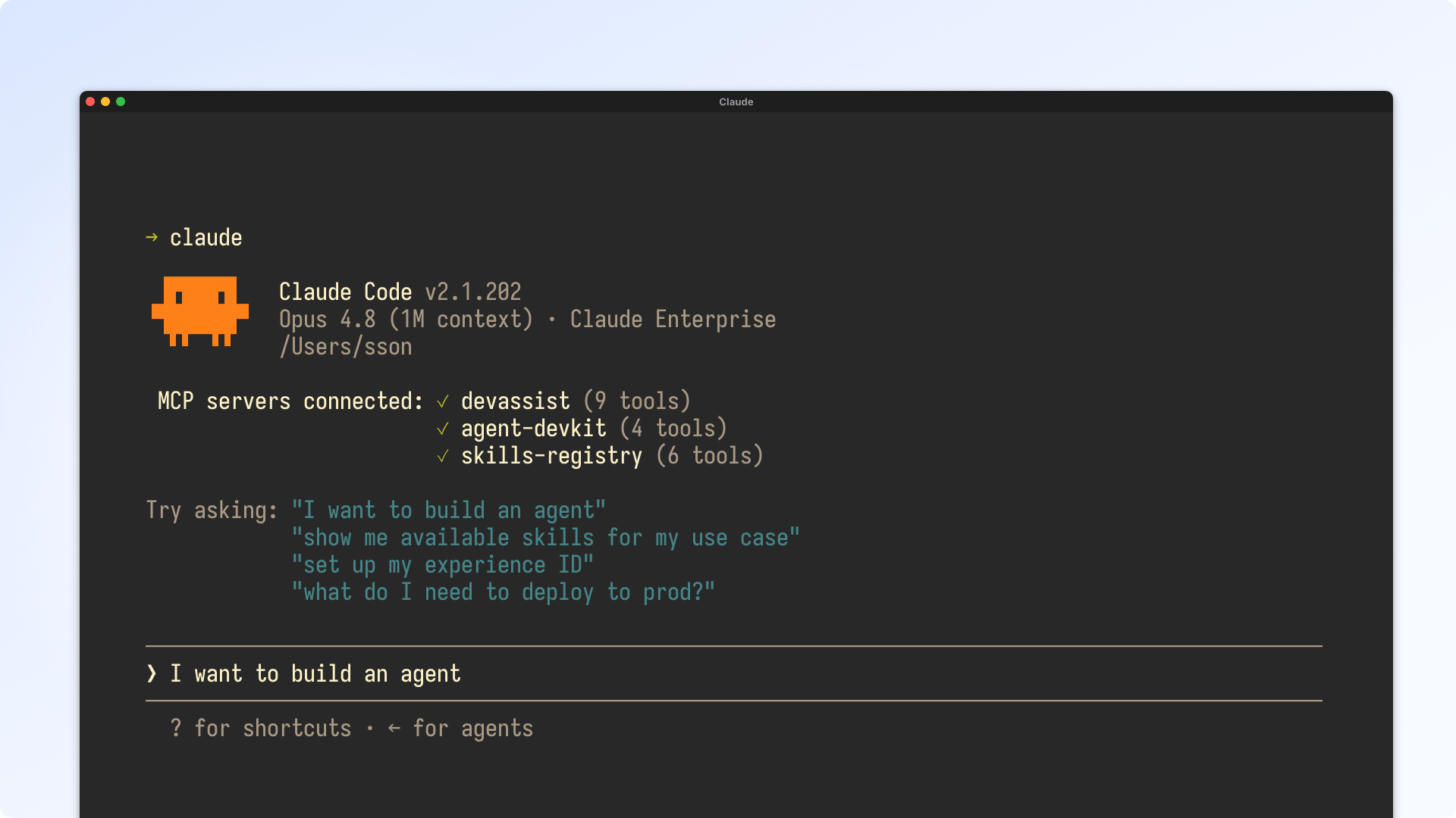
I pitched the idea of building the workflow as a plugin for AI coding assistants rather than a new surface β€” where a developer types "I want to build an agent" into Claude, and Claude handles the entire setup: service registration, IDPS configuration, starter kit scaffolding, skills installation, prompt loading, local testing, evals, to submitting their first PR. No context switching and digging around for the right documentation or Slack anecdotes!

The Prototype

Claude Code simulator to communicate the process

To make the idea concrete, I built a coded prototype that simulates what the experience looks like in a terminal using Claude Code (to build something that looks and behaves like Claude...! Whoa!). The reason was simple: seeing the flow was much easier to understand than explaining the idea to engineers. They immediately knew what I was talking about because they've done something like this before in their day-to-day. I met where the devs were to communicate the direction, so that we can meet our users where they were.

I recorded a walkthrough through the full flow: prerequisite detection, environment scaffolding, skills discovery via natural language, prompt loading, local testing with trace output, and quick evals against Langfuse data.

The coded prototype with prerequisite detection, scaffolding, natural-language skills discovery, local testing, and evals, all from the terminal.

Validation

I took the walkthrough back to the people the research was about.

Before pitching it internally, I shared the walkthrough with actual developers β€” the same population whose churn started this whole investigation. The point was to check the fix against the problem: if these were the people who'd bounced off the old setup, did the new flow actually land?

It did, and pointedly on the exact thing the research had flagged. One developer's first reaction was to ask whether it set the agent up "as if done on a paved path" β€” the paved-vs-gravel path distinction that had surfaced verbatim in the survey comments. When I confirmed it did, the response was immediate:

"This looks great and very valuable experience for developers like myself."

β€” Developer, after seeing the walkthrough

Others compared it straight against the status quo β€” "this looks much better than the current state, the flow feels smoother" β€” and one reviewed it in detail, called it "clear flow and easy to follow," then started listing what he'd want next. That last part mattered most: people don't invest effort extending something they don't believe in. The fix wasn't just tolerable, it was something they wanted to build on. That's the validation I brought to the team, and this prototype became the spec; the PM wrote the PRD from it, and with everyone on the same page, the team was able to ship the workflow as Day-0 Agent Setup.

"Rather than building a new surface, we are bringing the agent development workflow directly into agent-assisted development surfaces such as Claude or Cursor."

β€” From the PRD, based on the prototype demo

The Outcome

From prototype to a shipped plugin.

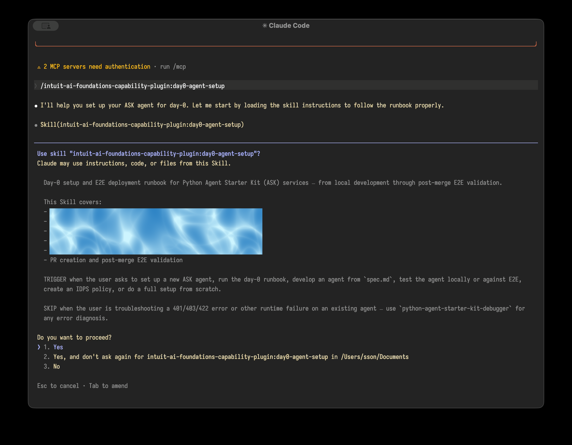
The workflow shipped as Day-0 Agent Setup and now live in the Intuit Developer Plugin Registry. It handles the numerous steps in the massive diagram so engineers can go from zero to a running agent without manual cross-tool wiring.

Actual live plugin running on my local Claude Code

The plugin is live and running on my local Claude Code instance! Redacted company specific setup setps

Shipped
Day-0 Agent Setup is live in the DevAssist Plugin Registry & Intuit Desktop app
Zero
New surfaces required β€” the workflow lives inside tools developers already use
2–6 wks β†’ hrs
Target time-to-first-agent collapsed from weeks of cross-tool setup to a single command
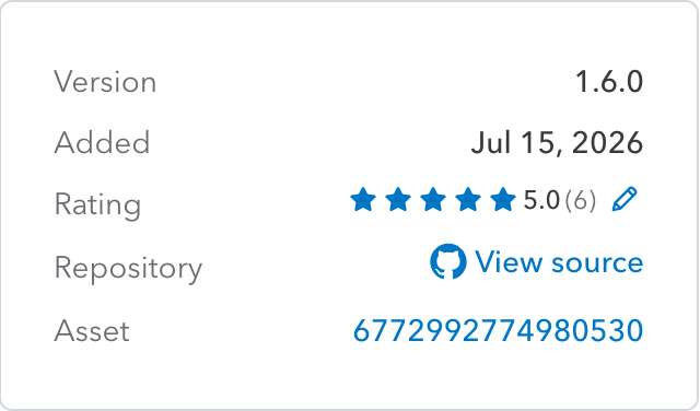
Plugin registry entry showing version 1.6.0, a 5.0 rating from 6 reviewers, and a link to the source repository

A perfect 5.0 from every reviewer on the plugin registry β€” a rare signal on an internal tool most people never bother to rate.

Reflection

The thing I had to get over first was whether "no UI" counted as a design output. There's a strong pull in product design toward building screens β€” it's visible, it's tangible, it's easy to show in a review. But the developers we were designing for don't live in browsers. They live in terminals and editors. Once I accepted that meeting them there was the right call, the direction became obvious. The harder part was making that case to people who were expecting a Figma file.

02 β€” Product Design & Strategy

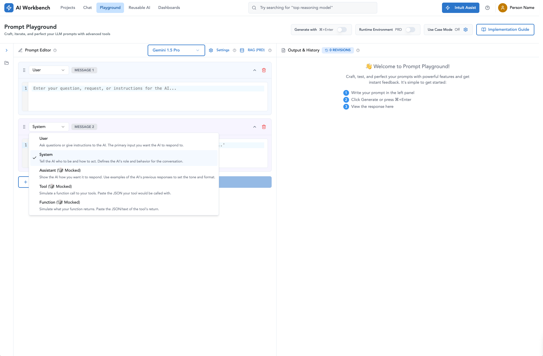
Prompt Playground

Unifying Intuit's AI platform: bringing Prompt Playground to the global level

Lead Designer, Platform Strategist UI/UX disparity audit React prototype Design coaching
Prompt Playground UI

Executive Summary

Two tools, 10,000+ users, one fractured experience.

At Intuit, prompt engineering is at the heart of building generative AI capabilities. But our tooling was deeply fractured: developers were forced to create rigid project containers in the AI Hub just to test a prompt, while 10,000+ monthly users relied on a separate legacy internal tool with a competing prompt feature.

I led the evolution of Prompt Playground from a nested tool into a global platform experience. By conducting a systematic UX audit of both tools, uncovering deep user friction, and building an interactive React prototype, I reconciled GenStudio's instant simplicity with Prompt Playground's advanced engineering power β€” doubling adoption and delivering a unified source of truth for prompt engineering.

1: The Origin: Evolving Prompt Playground (V1–V4)

The Initial Challenge

Developers were building around us.

To build AI features, developers were required to create a "GenAI Experience" asset first, which was a conceptual group that held all things related to enabling that AI Experience. While refining prompts is a core part of that build cycle, the existing Prompt Registry was merely a place to save finished prompts and offered no help in crafting or testing them.

In adition, in early user interview sessions, a software engineer revealed he'd abandoned our tooling entirely for a local Python environment. He mentioned that our UI couldn't handle prompt segments, dynamic variables, or multi-turn message types, so he didn't even save the prompts in the registry. He wasn't an edge case. He was exactly the user we needed to serve.

Hands-On Execution & Coaching

Design it, document it, hand it off well.

I led the initial V1 β€” establishing structured prompt editing, model config controls, output viewing with trace/debugger tools, and a registry save flow. When handing the project to a junior designer, I authored a comprehensive onboarding doc covering research findings, design rationales, and component guidance, coaching him through critique as he carried V1 forward.

Each later version answered a specific signal: V2 reorganized spatial hierarchy from dev review; V3 added bulk output viewing and multi-run comparison for prompt engineering teams; V4 integrated evaluation frameworks and Responsible AI (RAI) review gates.

2 β€” The UX audit: Legacy Tool vs. Prompt Playground

After V1 shipped, I stepped back and identified a major platform issue: the legacy tool had 10,000+ monthly active users, 42% of them on its legacy "Prompt Design" feature. Two tools were solving the same problem with no coordination. Before bringing Playground to the global level, I ran a deep UI/UX audit to understand why users clung to GenStudio despite AIW's newer features.

UX disparity audit β€” where legacy GenStudio still beat the newer tool.
UX Touchpoint Legacy Tool Prompt Playground The friction
Zero state Clean & Focused: Blank-slate text box. Instant focus on prompt drafting. Cluttered & Dense: Pre-filled prompt templates users had to manually delete. Dense parameter sliders upfront. PP overwhelmed non-technical users who wanted quick iterations.
Prompt Execution Instant Output: Typing a prompt and clicking "Send" immediately displayed the output inline. Mandatory Modal: Prompted for an "originating asset alias" before running; hid sent prompt text behind a toggle PP created unnecessary structural friction before executing a test run.
Iteration loop Inline Diff Highlights: Automatically highlighted text changes compared to the previous revision. Reopen editor via a > button; no diff highlighting Hard to compare outputs across revisions
Session history 30-day auto history, no manual action One history per use case; overwritten on switch unless saved to Registry Users risked losing work if they forgot to register
Survey validation (N = 41 of 323 surveyed)
  • Preferred GenStudio for simplicity 75.6%
  • Valued change/diff highlighting 46.3%
  • Had ever tried Prompt Playground 15.0%

Change/diff highlighting was GenStudio's highest-rated feature (4.27 / 5).

Deep Qualitative Insights

What real builders said.

Beyond the survey, qualitative FMH interviews with top builders revealed critical platform gaps the numbers alone couldn't explain.

  • Senior agent SWE. Ditched internal tools entirely β€” his prompt architectures were tied to external execution tools that neither product supported.
  • Credit Karma prompt engineering team. Lost three weeks of work to a session-history bug and an unannounced default backend system prompt β€” forcing them to third-party tools (e.g. Dify) to chain multi-agent flows.

"With most of the company moving to agents, simple prompts aren't enough anymore."

β€” Senior SWE, agent development team

3 β€” Reconciling the experience: the Global Playground

Rather than force a lift-and-shift, I designed a unified Global Prompt Playground that combined GenStudio's rapid zero-state drafting with Playground's advanced engineering controls β€” one surface serving both audiences.

Quick-start canvas β€” from GenStudio

  • Clean zero-state editor
  • Instant run & output stream
  • 3-way visual diff comparison
  • Auto 30-day session management

Advanced engine β€” from Playground

  • Collapsible model parameter panel
  • Role-based message blocks (System/User/Tool)
  • Reusable variables {{var}} & segments
  • Code snippet export (Python/JSON)

Core Design Solutions

  • Progressive disclosure layout. The primary view opens with a clean, un-cluttered prompt editor and instant output stream. Parameter sliders (temperature, top-p), Knowledge Bases (RAG), and model selectors sit in expandable panels.
  • 3-way side-by-side diff inspector. Builders drag-and-drop up to three revisions side by side, visually highlighting text diffs, parameter shifts, and token counts.
  • Modular prompt construction. Message blocks with explicit roles (System, User, Assistant, Tool), supporting dynamic variable inserts and reusable prompt segments.
  • Session vs. registry architecture. Unlinked drafting from permanent code. Unsaved sessions persist for 30 days for low-stakes drafting, with a clear "Publish to Registry" flow to bind production-ready prompts to GenOS Use Cases.

4 β€” Prototyping in code & delivery

Prototyping Approach

A real link, not a static Figma flow.

Because generative AI outputs are dynamic and non-deterministic, static Figma clickthroughs couldn't capture real iteration patterns. I built a fully interactive React prototype hosted on internal GitHub Pages and shared the live link during FMH sessions β€” users typed real prompts, manipulated parameters, and evaluated multi-column diffs. Feedback reflected real iteration patterns, not reactions to a happy path. I then translated those validated patterns back into our core design system components.

The Global Playground vision and architecture were presented at Intuit's AI Share Out & Architecture forum with leadership present, and across org-wide Pre-GED workshops.

Interactive React prototype

Delivering It in Cycles

From a validated prototype to a shippable plan.

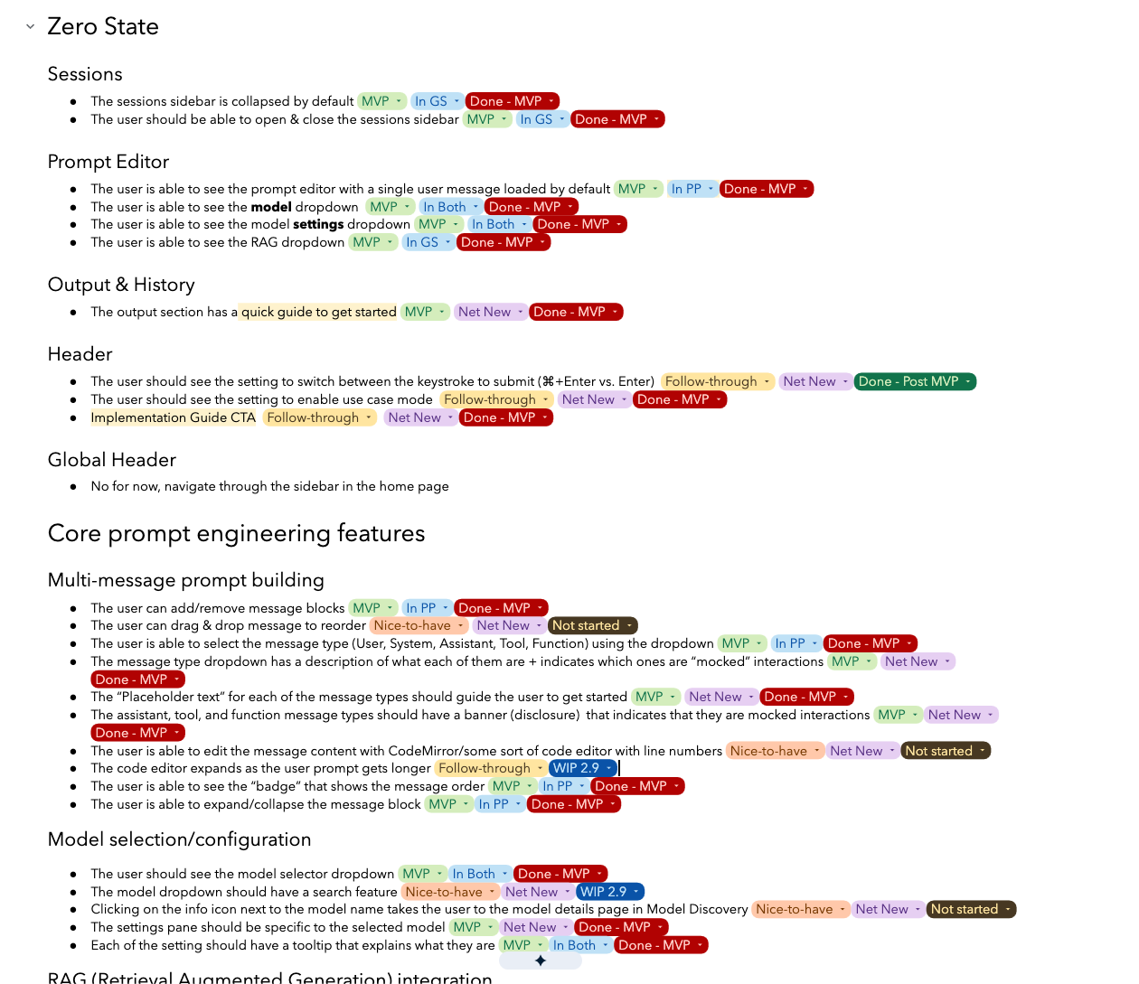
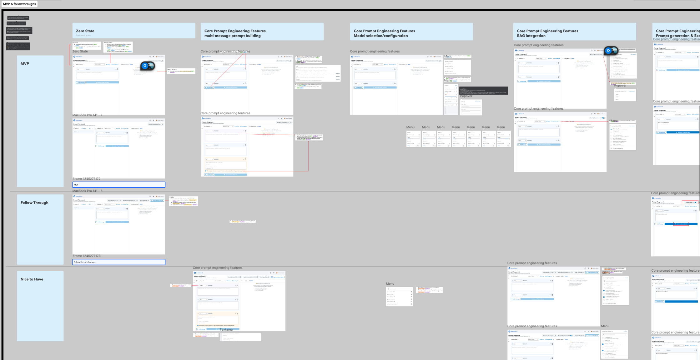
The prototype told us what worked β€” but it was one dense surface, and we had two engineering teams and a live user base to protect. So I broke the validated feature set into an MVP / Target State / Nice-to-Have matrix and mapped it to phased releases. This gave PM and engineering a shared language for prioritization, kept scope from ballooning before launch, and let the team ship the Global Playground in cycles rather than one risky big-bang release. Key MVP features shipped in December '24; all three phased releases are now live.

Feature prioritization matrix β€” the plan I handed PM and engineering to ship in cycles.
MVP (Dec '24) Target State Nice to Have
Decoupled global entry point Dynamic per-model settings Drag & drop message reorder
Single-run diff inspection GraphRAG multi-retrieval Canvas agentic workflow
Multi-message role selection Multi-agent chaining System-message versioning
Feature breakdown doc handed to PM and engineering
Feature breakdown figma handed to engineering

5 β€” Impact & reflection

2Γ—
User growth in the weeks following the V2 global relaunch
~200
Power users logging 10+ sessions β€” a habitual adoption signal
3
Phased releases shipped to production

Reflection

The most useful thing I did on this project wasn't a design β€” it was the realization that we had two products solving the same problem with no plan to reconcile them. Once that was the question, the answer ("merge them, and here's the plan") was easy to see. The screens themselves were the cheap part.

03 β€” Design Systems

Platform Design System

Unifying 4 fractured products under one design system

Lead Designer + Component Developer Figma library + Storybook 4 products, cross-platform
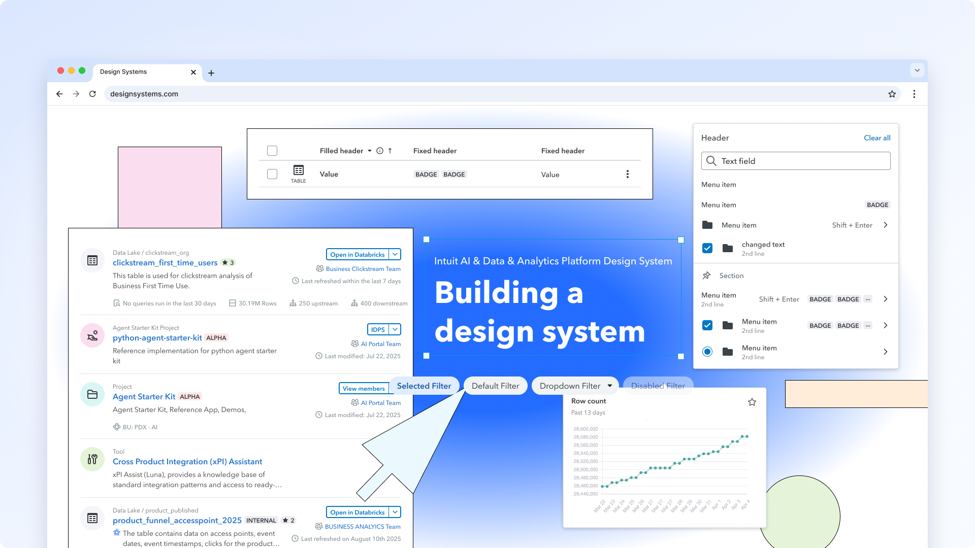
Design system overview

The Problem

A strong foundation, but not built for dense platform workflows.

Intuit already had a mature, company-wide design system (IDS) supporting hundreds of designers and thousands of developers across flagship products like TurboTax, QuickBooks, and Mailchimp.

But our team worked in a more technical domain: interfaces that had to handle dense data, complex configuration, multiple statuses, and layered information beyond what standard product patterns were designed for.

As a result, four product teams were each reinventing the same components β€” designers rebuilding them in Figma, developers hand-wiring approximations in code β€” and critiques kept getting stuck on component-level decisions instead of the user flow.

We didn't need to replace IDS. We needed a specialized layer that extended it for the realities of our platform β€” and every extension came from a real workflow need, not a bigger library for its own sake:

  • Higher-priority and inline-icon badge states, so status could be scanned at a glance in data-heavy views.
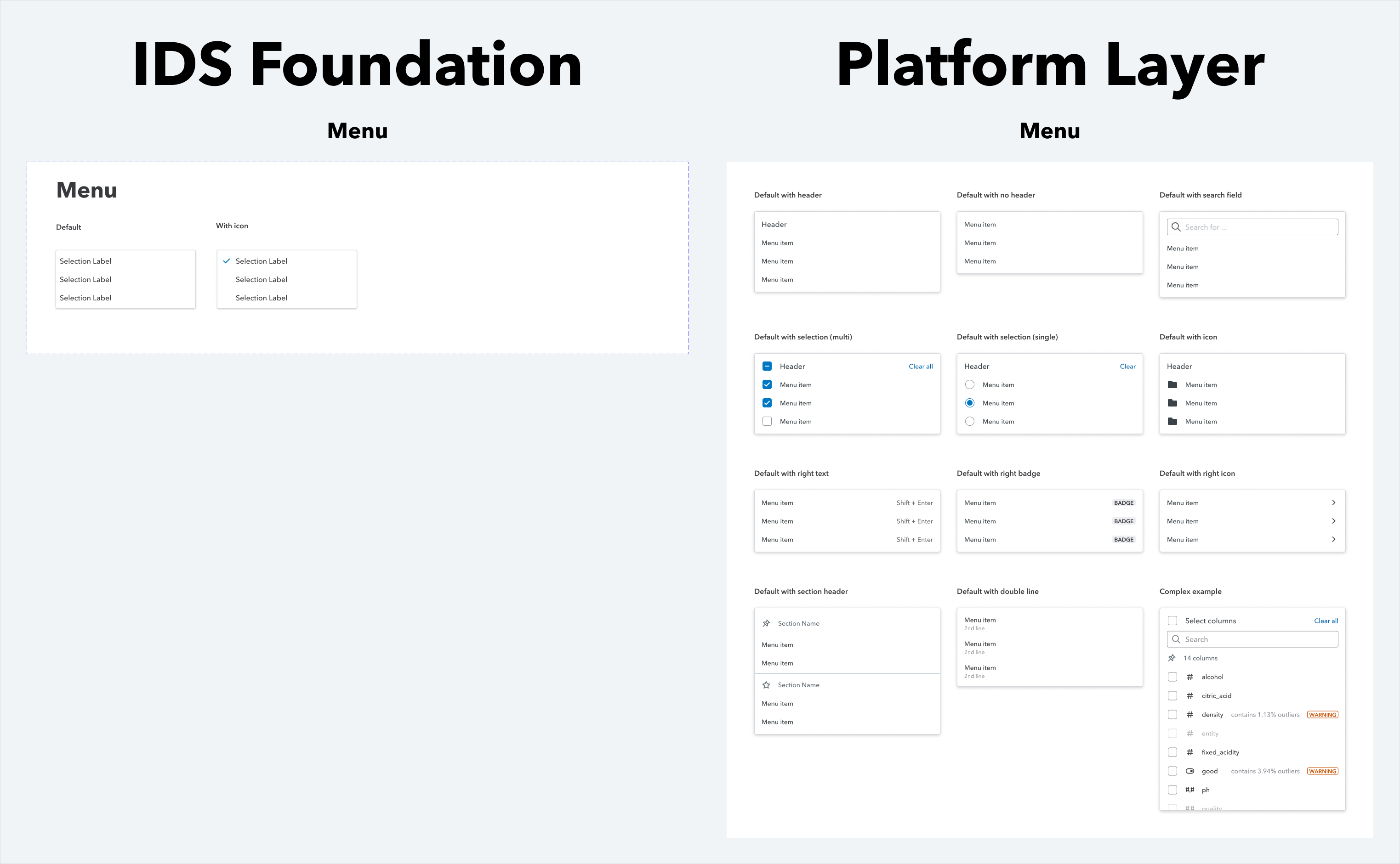
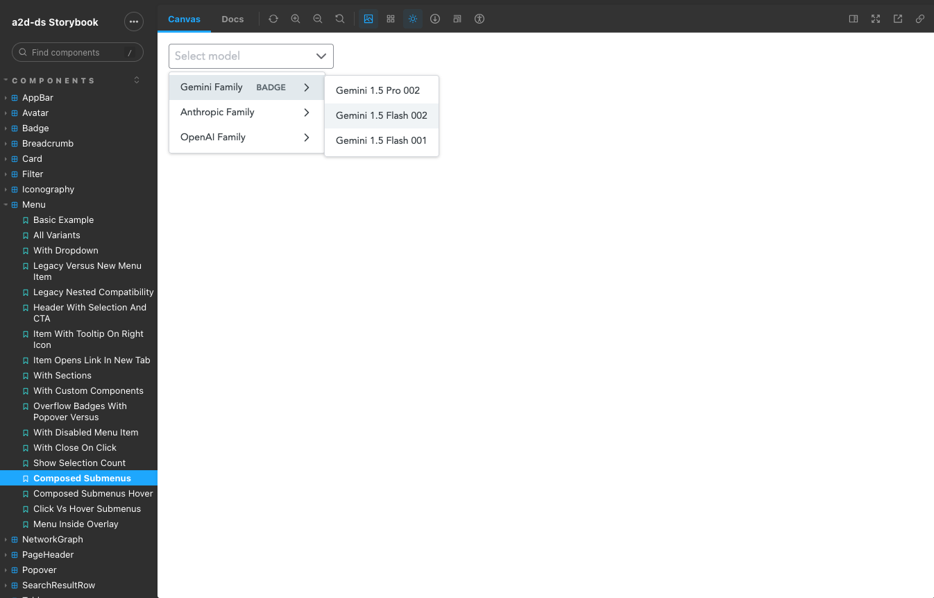
  • A menu that supported search, grouping, and nested actions, because our workflows had more to configure than a simple dropdown could hold.
  • Density, multi-status, and configuration patterns that reflected how our platform actually worked β€” not decorative variants.
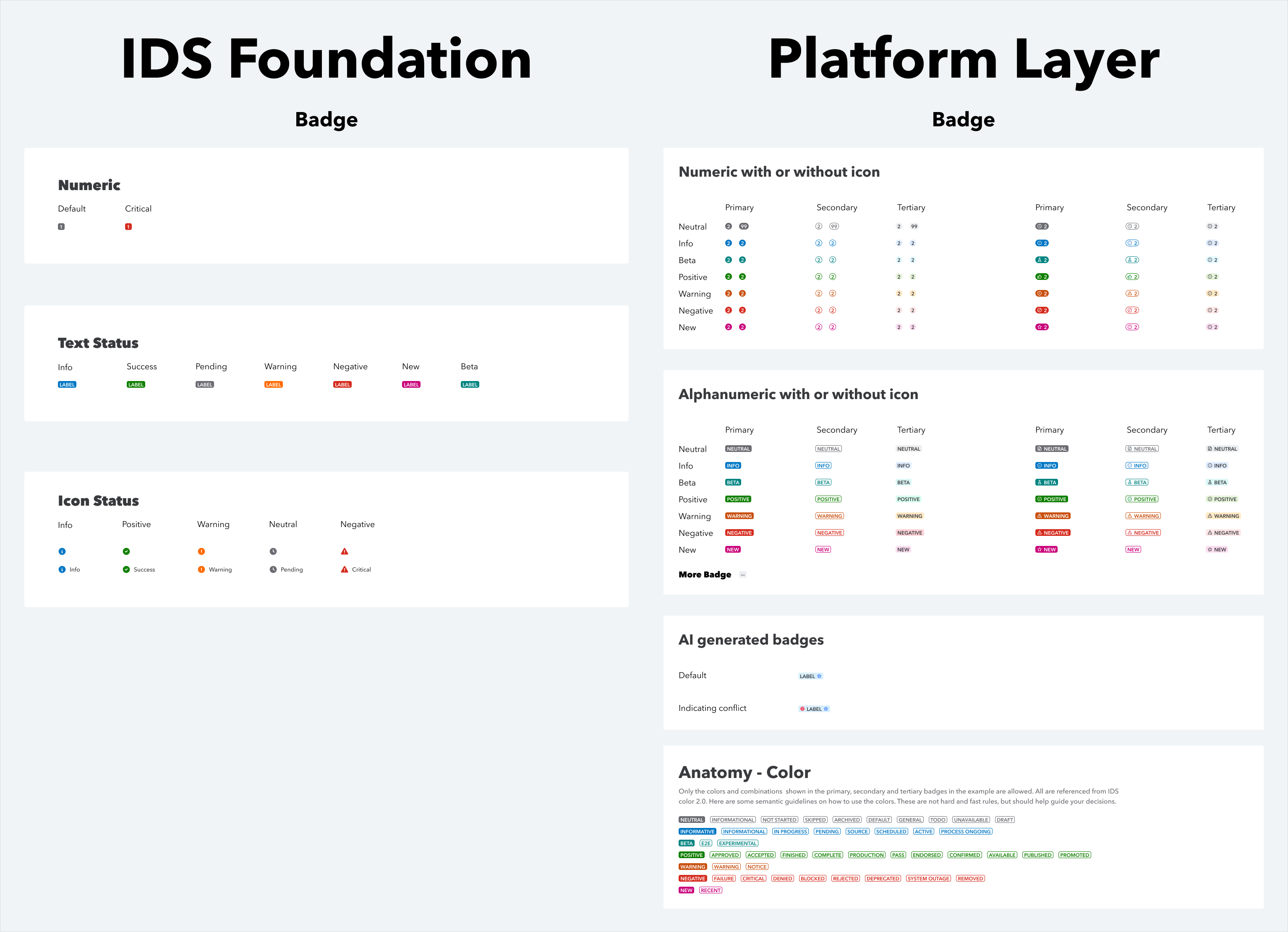
Base IDS Badge component compared to our extended platform layer
Added high-priority visual treatments and inline icon support, with usage guidance for priority, icon, and shape.
Base IDS Menu component compared to our extended platform layer
Supported search, grouping, nested actions, selection states, and multiple ways to organize dense actions.

My Role: Turning Patterns Into Infrastructure

Standardizing fractured experiences

I started by turning repeated patterns into reusable Figma components, documenting when to use them, and bringing those standards into design critiques. Over time, critiques became less about reinventing patterns and more about aligning on shared decisions: which component to use, what states it needed, and whether a new pattern belonged in the system.

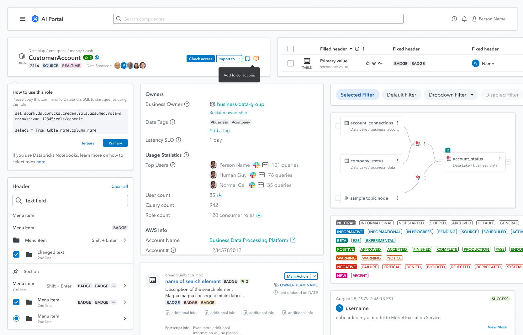
Because I came from a development background, I also contributed directly to the coded library. Engineering support was limited and volunteer-based, so I used my front-end skills and AI-assisted workflows to move components from Figma specs into working React components faster β€” while preserving the details teams depended on, including density, status states, configuration, and edge cases.

I also helped create the operating model around the system: monthly meetings with developers across platform teams, an open channel for bugs and requests, and a triage process for prioritizing what to build next. The system became maintainable because there was a clear way to request, discuss, build, and improve components.

Component library in Figma
Menu component in Storybook

Spotlight: The Search Result Row

Three products, three inconsistent search surfaces, one shared component.

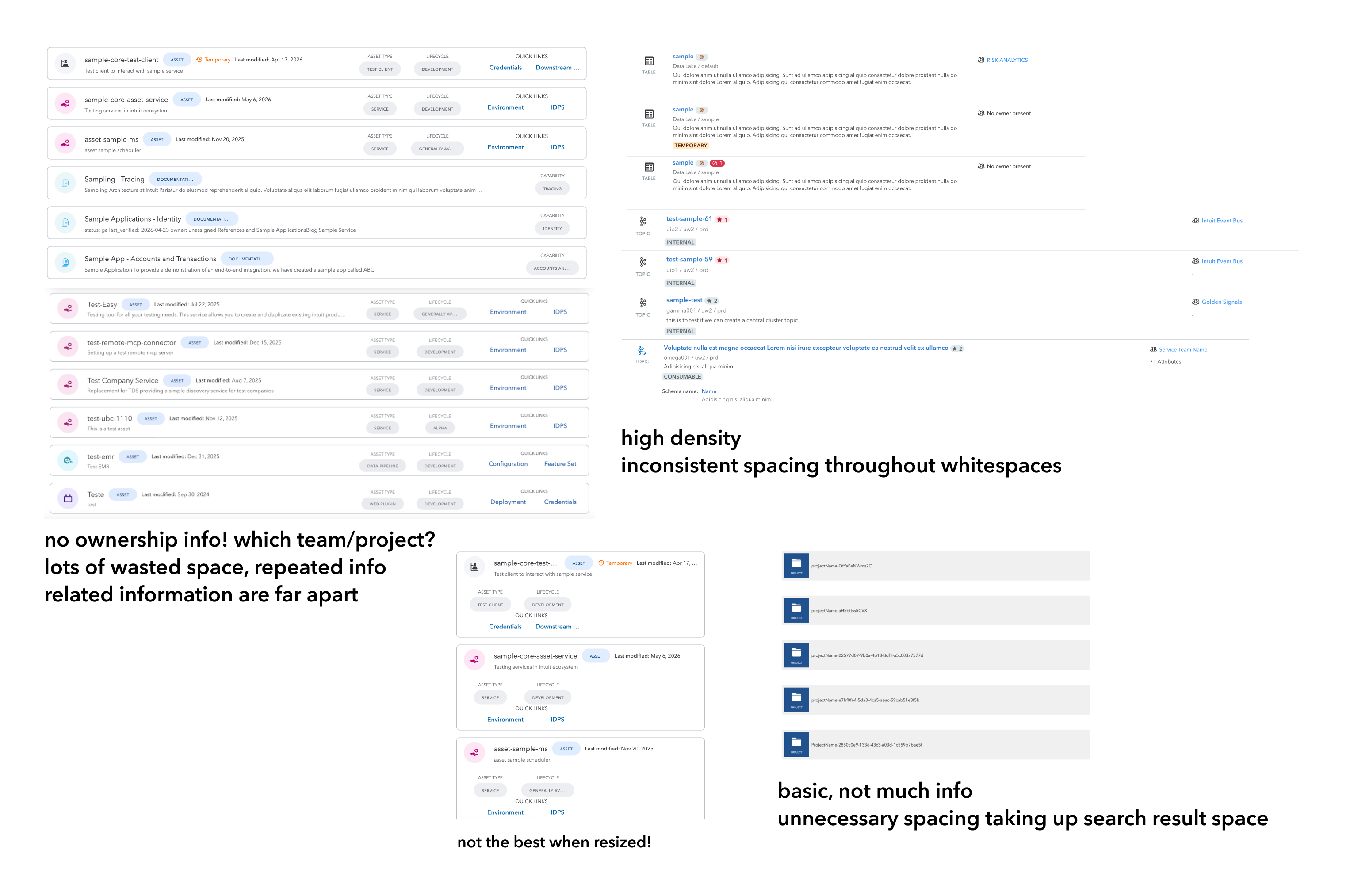
Search looked completely different in every product β€” and every version was broken in its own way. One crammed everything in at high density with inconsistent spacing. Another wasted space, repeated the same labels row after row, put related information far apart, and had no ownership info at all β€” you couldn't tell which team or project a result belonged to. A third was so barebones it surfaced almost nothing useful while still eating up the whole result area. The challenge was determining whether three seemingly different surfaces were actually variations of the same underlying pattern.

Three product search surfaces side by side, annotated with their problems: high density and inconsistent spacing; wasted space, repeated info, no ownership; and basic with too little info and unnecessary spacing
The starting point: the same job, solved three incompatible ways. I annotated what was failing in each surface before proposing anything.

The Synthesis

Find what's common β€” then find what should have been common.

I pulled apart all three surfaces and mapped the shared anatomy: a search input, category chips or tabs to divide results, the results area itself (table, card, or list), and inside each result β€” an icon, name, description, tags or badges, and a checklist filter. Some of these existed everywhere; some didn't exist anywhere but clearly should have (ownership was the big one). Naming that gap was half the work.

Then I set the principles the component had to hold to: a max-width bound of 1280px, grouping related information closer together, and reducing redundant and low-density info sprawl. Everything after that was iteration against those rules and against real team feedback.

First iteration of the search result row β€” minimal layout with name, type, label, and inline actions
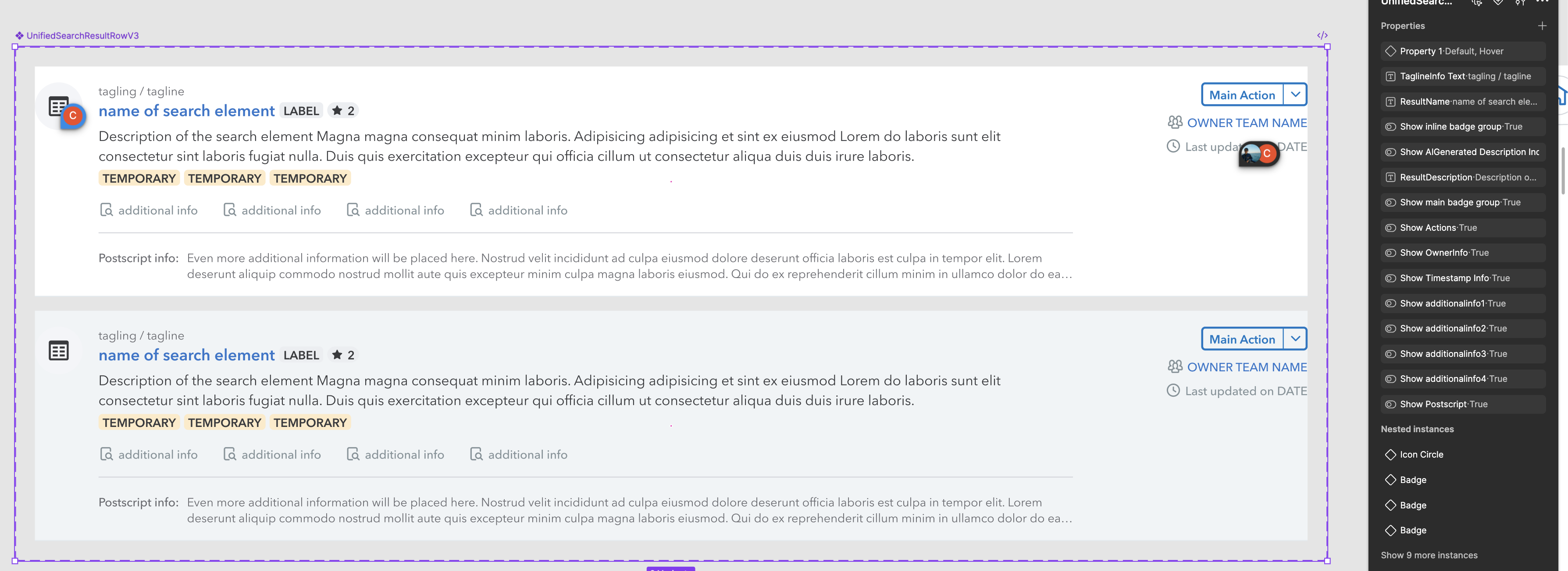
Second iteration β€” richer row with icon, tagline, description, tags, owner team, timestamp, and a main action
v1 β†’ v2: from a stripped-back row to one that grouped related info and finally surfaced ownership and freshness.
UnifiedSearchResultRowV3 in Figma with its full property set β€” badge groups, AI-generated description, owner info, timestamp, four additional info slots, postscript, and actions, each toggleable
v3 β€” UnifiedSearchResultRowV3: every major element is toggleable, so the component can flex from sparse to dense use cases without requiring teams to fork it. The Figma properties map directly to React props, which means designers and developers are finally working from the same model instead of translating across a handoff.

The Guidelines

The component is only half of it β€” the rules for using it are the other half.

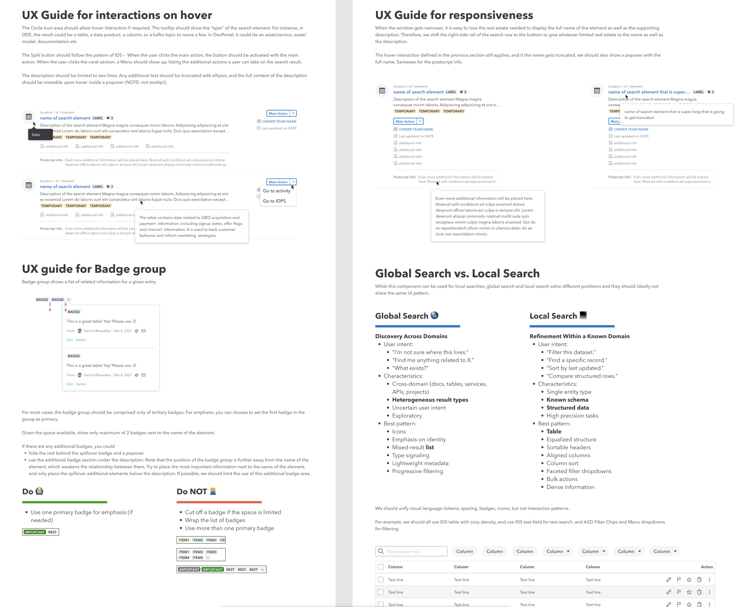
A flexible component with no guardrails just recreates the original problem in a new place. So alongside the component, I wrote UX guidelines based on product audits, cross-team feedback, and the devisions that shaped each iteration. The goal was to help teams understand not just what they could toggle, but what they should use and why.

UX guidelines for the unified search result row, documenting when to use each element and how to keep results scannable
UX guidelines for the search result row, written up in the shared component library.

From Figma to Shipped

I didn't hand off the spec β€” I coded it and put it in a real product.

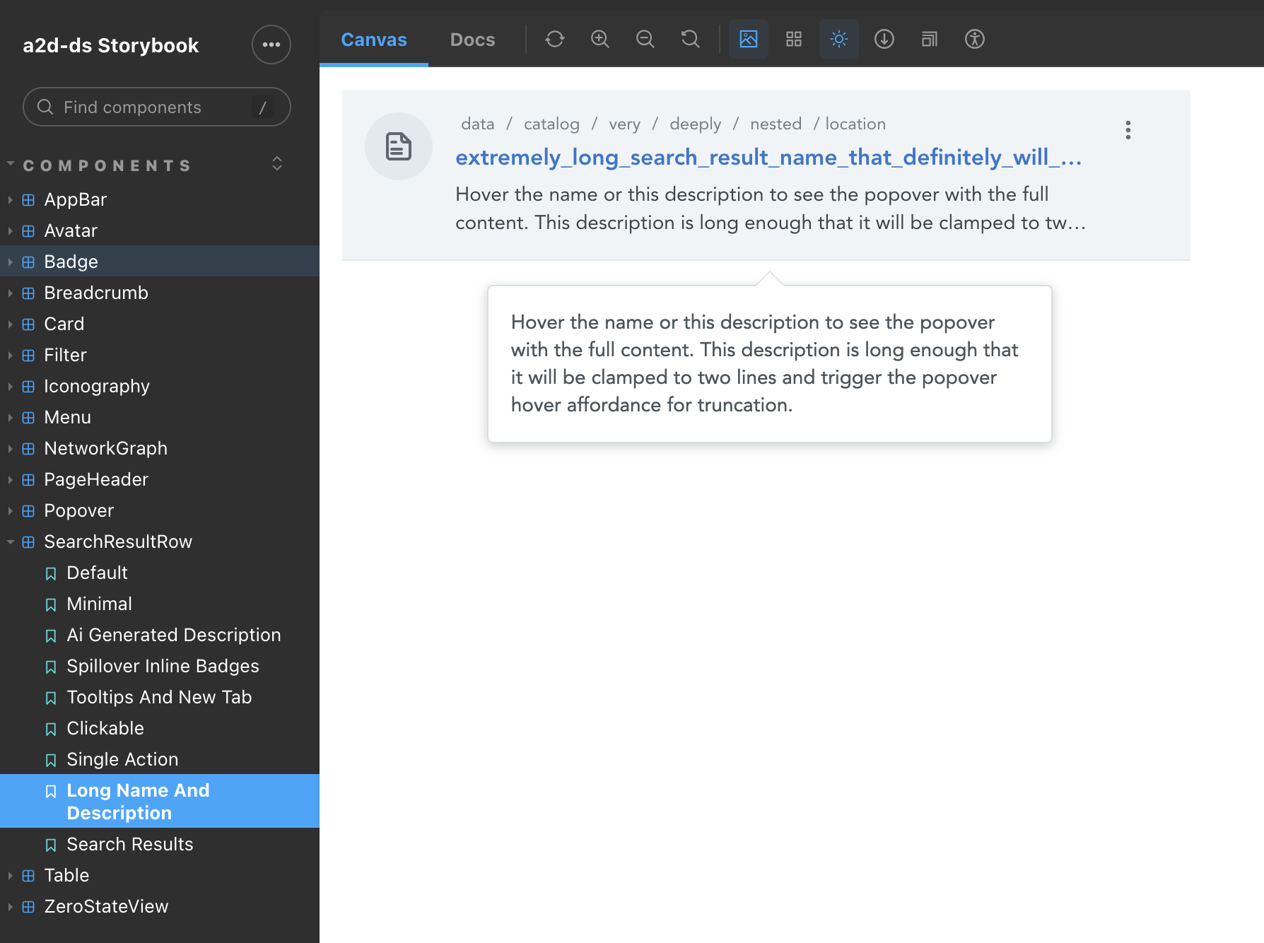
A component only counts once it is in someone’s product. So I built the search result row into the design system as a published package, composed from existing system pieces like menus, badges, and icons rather than reinventing them.

It was styled entirely with design tokens, with no hardcoded colors, and shipped with unit tests, snapshots, Storybook stories, and documentation so the next team could adopt it without asking me how it worked.

Search Result Row in Storybook
Search Result Row component in Storybook

Building it end to end surfaced things a Figma file never would. A design call β€” the right-rail actions read cleaner as a single kebab menu than as a split button β€” was one I could just make in the code. And while wiring it up I traced a two-year-old dependency bug: a stale package version hoisted at the monorepo root was silently overriding the live one, so local changes to a shared component were being ignored across the whole system. Fixing it unblocked more than my own component.

Then I closed the loop: I opened a pull request against one of the products to swap its bespoke search interface over to the shared component, rolled out behind a feature flag as a canary so the team could validate it in production safely. The migration removed more product code than it added β€” which is the whole point of a design system, made concrete.

Recent Shipping

The system is alive, not a one-time launch.

Over the past year I've shipped Menu v2, Card, Popover, Breadcrumb, an expanded AI icon set, and a redesigned PageHeader, plus a long tail of fixes driven by real in-product usage rather than Storybook edge cases. I also led the React 16.13 β†’ 18.3 upgrade for the repo so component authors weren't blocked by the older runtime.

Most of these came directly out of pain we were seeing in product reviews β€” components that worked in isolation but broke when composed inside an actual page. Pulling those fixes into the system meant the next team to hit the same problem just got the fix for free.

React 18
Repo-wide runtime upgrade so component authors aren't blocked on old infra
6+ new
Shared components shipped across the platform, reducing one-off product implementations.
4
Product surfaces aligned around shared Figma and React components.

Reflection

The reason I keep coming back to design systems work is that it sits at the intersection of product judgment, technical constraints, and adoption. The puzzle is not just β€œCan we design one component?” It is β€œCan four teams with different needs trust the same component enough to stop rebuilding their own?”

But building the thing is the easy half. Getting teams to use it is about trust and convenience as much as quality. Annotating every spec with the relevant component was one lever: adoption did not depend on developers remembering to check the system because the component was already called out at handoff.

What I would invest in next is making the system’s value visible earlier β€” tracking usage, surfacing time saved, and giving contributors a clearer sense of ownership over what they helped build.

04 β€” Designers as Builders

Making AI-assisted building usable for non-developers

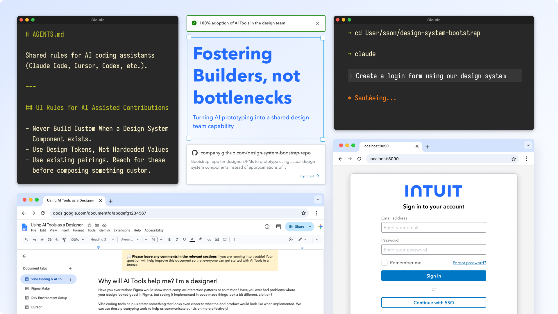
I turned AI-assisted prototyping from an individual technical skill into a repeatable team capability.

Enablement Β· setup Β· 1:1 coaching Design System bootstrap repo Β· AGENTS.md Designers, PMs, content, ops, managers 100% design-team adoption
Refactoring codebase

The Problem

AI prototyping was powerful β€” but only if you already knew how to be a developer.

Across the Platform org, more people were experimenting with tools like Builder, Cursor, and Claude Code. But the people who could benefit most from faster prototyping β€” designers, PMs, content designers, ops partners, and managers β€” were blocked by setup, repo conventions, design-system dependencies, GitHub workflows, and the hidden knowledge required to make AI output usable inside an enterprise codebase.

A designer could prompt a tool to create an interface, but the result often missed the design system: components looked close but were custom-built, styles were duplicated, and tokens were hardcoded.

And starting from a blank React app, the internal design-system components imported but rendered incorrectly because the token stylesheets and dependencies were missing.

It became a new version of an old handoff problem: designers still filed tickets and waited, developers still cleaned up approximations, and the team was faster in theory but not in practice.

The Opportunity

If the whole team could build with AI safely, we'd move faster without the handoff loop.

The goal was never to turn every designer into an engineer. It was to remove the setup burden, encode the right defaults, and give designers and cross-functional partners a governed way to build with AI against the real design system and GitHub workflow.

That meant prototypes could get in front of customers sooner, and what developers received would be closer to real implementation instead of a static file to rebuild.

The Hidden Setup Gap

The real barrier wasn't AI β€” it was setup.

The issue wasn't willingness. It was that AI coding tools assumed a developer baseline many non-developers had never needed before. "Use Claude Code" sounds simple in theory, but the actual starting line was much further back β€” some designers had never opened a terminal, authenticated through GitHub, cloned a repo, installed dependencies, or seen how an AI coding agent connects to a codebase.

So enablement couldn't start with advanced prompting or contribution workflows. It had to start with the basics: what the terminal is, how GitHub authentication works, how to open a project locally, what an environment setup error looks like, and how to recover when the agent gets stuck. The bootcamp became less about teaching people to "code" and more about making the invisible technical assumptions visible.

That's why the bootstrap repo mattered. Once those basics were demystified β€” and once as many setup decisions as possible were removed β€” designers could actually reach the design problem and prototype with the design system, instead of getting blocked long before they ever got there.

That's why the guide met people where the fear was. The setup chapter explicitly reassured people that they wouldn't break their machine and that we'd go step by step. The tone was deliberate β€” the barrier was confidence as much as knowledge.

My Role

Translating developer-native workflows for the rest of the team.

I became the bridge between design, engineering, and the new AI tooling workflows β€” helping designers, PMs, ops partners, content designers, and managers get from "I want to try this" to "I can build, host, and share a working prototype." That meant hand-holding people through the full path: setting up their environments, choosing the right tool for the task, prompting against the design system, debugging missing dependencies, hosting prototypes in GitHub, and knowing when a prototype could become a real contribution to a team's codebase.

The Tool Ladder

Start where you're comfortable; climb only as far as you need.

Part of being the bridge was matching the tool to a person's technical comfort level instead of pushing everyone into the most advanced workflow. I laid out a tool ladder: prompt-to-prototype tools for quick wireframing, an AI IDE for people ready to touch code in a repo, and a terminal-based coding agent for heavier implementation work. People could start where they were comfortable and climb only as far as they needed.

"AI tooling for non-developers. Sooji hand-held Designers, PMs, Ops, Content designers (and me!) through leveraging Builder, Cursor, Claude Code. She walked people step-by-step through setting up their environments, leveraging design systems to vibe code, all the way to hosting their prototypes in GitHub or contributing to their respective teams' codebase."

β€” My manager, year-end review

The System I Built

A guide, a bootstrap repo, and shared AI rules.

The first blocker was setup knowledge. The paved-path engineering repos came with the right design-system setup, but also the overhead of a full product codebase. Blank starter apps were lighter, but missing the internal token stylesheets, dependencies, and component-registry setup that make the design system render correctly. So I built a prototype bootstrap repo people could clone instead of scaffolding their own β€” pre-wired with the internal component registry, CDN token stylesheets, and design-system dependencies. From the first prompt, someone could tell an agent "use the design system button" and get the right component, correctly styled.

Then I wrote an end-to-end enablement guide covering setup, tool choice, prompting patterns, common errors, GitHub hosting, and the Intuit-specific gotchas that usually only come from years of shipping inside the company. I paired it with 1:1 setup sessions so people could get over the first intimidating step with support β€” not just learning to code, but learning how to interact with an AI agent at all.

I authored and maintain the guide myself, but it didn't stay static: it grew from the real questions the people I coached ran into. Whenever someone hit something the guide didn't cover, I'd walk them through it and then fold the answer back in so the next person never had to ask. That feedback loop kept it current with wherever people were actually getting stuck β€” and the fact that it kept accumulating questions was itself a sign the team was really using it.

Finally, I added shared AI rules to the repo. They tell coding agents to prioritize design-system components, use tokens instead of hardcoded values, and avoid custom components when a system one already exists β€” so the right defaults were encoded into the workflow, not left to individual memory.

Why the rules were necessary

"Looks right" and "belongs in the system" aren't the same thing.

Part of the guide was diagnosing exactly why AI output drifted. When you point a prompt-to-prototype tool at a design-system library, it doesn't reuse the real, production components β€” it reads the color and type styles and re-generates its own lookalike versions on top of a different underlying UI library. The result is close enough to fool a screenshot but wrong in the code: custom components where system ones exist, and the same drift I was cleaning up in product repos.

You can nudge it toward the right component one frame at a time, but the moment you add another element the cycle repeats. That's the gap the bootstrap repo and the AGENTS.md rules close by default β€” they point agents at the real component registry instead of letting them re-invent it.

"Because the rule is set for the agents, the individual builders don't have to learn or be aware of the design rules β€” they can focus on the feature."

β€” From the AGENTS.md rationale
AGENTS.md
# Shared rules for AI coding assistants (Claude
# Code, Cursor, Codex, etc.). Scope: design
# system usage and tokens only.

## Design System Priority
# Search in this order β€” each tier owns a
# different class of component.
1. @ids-ts/*  β€” buttons, inputs, modals, typography
2. @qbds/*    β€” trowser, toggle, toast
3. @a2d-ds/*  β€” page headers, cards, tables, badges
4. @cgds/*    β€” app-level components
5. Custom styled-component β€” only if nothing fits

## Never build custom when a DS component exists
// Wrong β€” will be flagged in review
const CustomButton = styled.button`...`;

## Use design tokens, not hardcoded values
color: var(--color-text-primary);   // right
color: #1f2937;                    // wrong

# The rule lives with the code, not in a
# reviewer's head β€” so review isn't the bottleneck.

One source, every editor

Different people, different tools, same rules.

People across the company use different AI editors β€” Cursor, Claude Code, Codex. Each reads its own config file, so a rule written for one is invisible to the others. Rather than maintain three drifting copies, I kept the full ruleset in AGENTS.md as the single source of truth and made CLAUDE.md and .cursorrules thin pointers back to it. Update the rules once; every editor stays in sync.

The Artifacts

What people could clone, read, and use immediately.

The bootstrap repo and enablement guide turned a developer-native setup process into a repeatable starting point for non-developers. Instead of scaffolding a blank app, finding the right dependencies, and debugging missing design-system styles, people could clone the repo, follow the guide, and start prompting against the real design system.

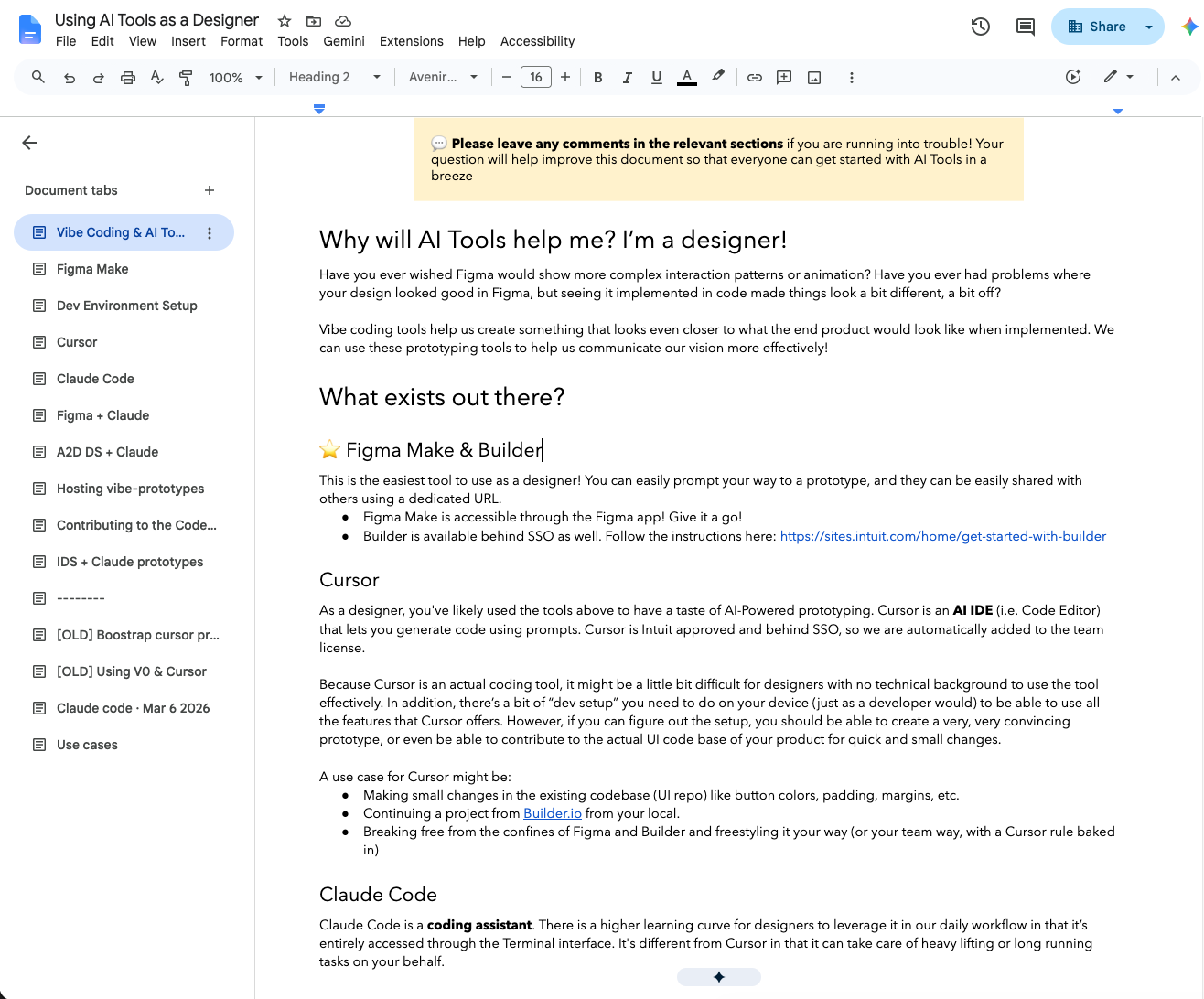
Enablement guide β€” non-paved-path prototyping, end to end

Setup, modes of operation, and the Intuit-specific gotchas you only learn from years of shipping. Shared org-wide, paired with 1:1 sessions β†’ 100% team adoption.

Enablement guide document β€” multi-section table of contents covering Figma Make, Cursor, Claude Code, and contributing to the codebase
Shareable doc for everyone in the org + outside of the org!

Making the Defaults Real

I also applied the same standards directly in product code.

Across two large product repos, I opened pull requests that replaced AI-generated lookalike components with real design-system components, removed duplicated styles, pulled repeated patterns into shared components, and surfaced platform features the original implementation had buried. Leaning on Claude let me scan whole repos and fix recurring mistakes at scale, while my development background helped me confirm, redirect, and review the output.

Those 20+ PRs showed the difference between "AI generated something that looks right" and "AI helped produce code that belongs in the system." But the more important move was encoding the standards into AGENTS.md so future AI-assisted contributions started from the right defaults.

Why this matters

It changed who could participate in building.

This was not just about faster prototypes. Designers could move beyond Figma clickthroughs and build real coded prototypes with real interactions and real design-system components β€” complete flows, wired in minutes instead of the hours it takes to fake every click target in Figma.

That changes what a prototype is for. It's real enough to put in front of customers and watch them actually use it, not click a prescribed path. And because it's built on the real design system, developers can lift and ship it rather than rebuild it from a static file β€” so the design-to-dev handoff stops being a rewrite.

And it wasn't only designers. PMs and content designers could explore ideas without waiting for a developer to scaffold the first version. Developers received prototypes and contributions closer to real implementation instead of static files to rebuild from scratch.

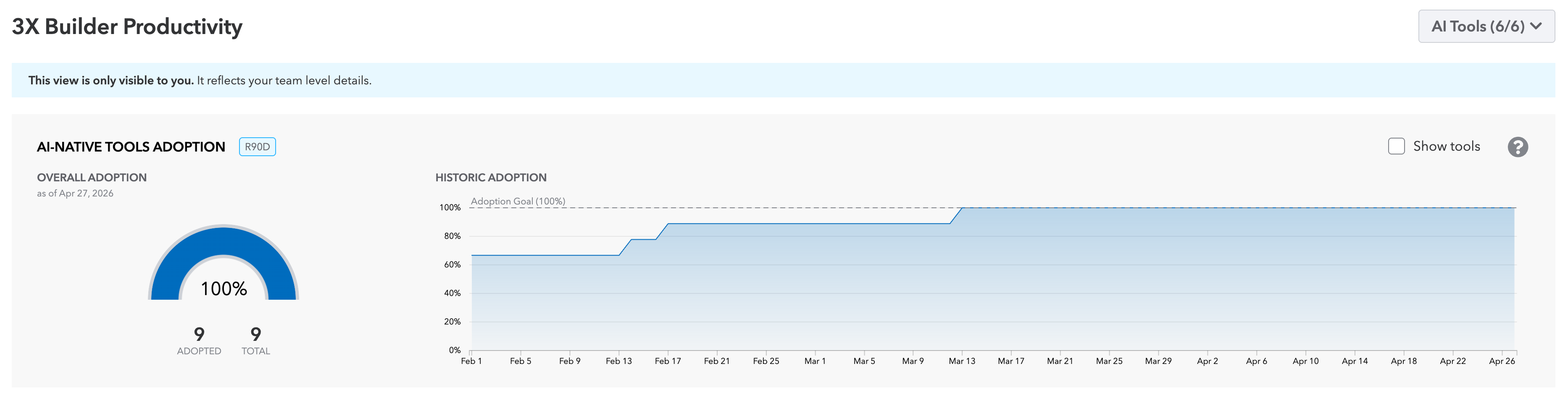
The A2D Design team hit 100% adoption of the prototype setup and bootstrap repo, and I supported designers, PMs, ops partners, content designers, and managers through setup, prompting, hosting, and contribution workflows.

AI-native tools adoption dashboard showing 100% overall adoption β€” 9 of 9 team members adopted β€” with the historic adoption curve climbing to the 100% goal line
AI-native tooling adoption reached 100% of the design team (9/9), tracked in the team dashboard rather than self-reported.

The bigger unlock wasn't that I could code faster with AI. It was that I made AI-assisted building usable for the rest of the team.

100%
A2D Design team adoption of the prototype setup & bootstrap repo
5 roles
Designers, PMs, content designers, ops partners & managers coached from "want to try" to "shipped a prototype"
Governed by default
Bootstrap repo + AGENTS.md kept AI output aligned to the design system before review

Reflection

The real unlock wasn't coding faster. Cleaning up repos and writing rules mattered, but they were supporting acts. What changed the team was making AI-assisted building accessible, governed, and repeatable β€” so the people who'd been blocked by setup and repo conventions could prototype, contribute, and use the design system safely on their own. Turning an individual superpower into a shared capability is the part I'm most proud of.

05 β€” Product Design, Platform

Skills Discovery

A self-serve surface for the people building agents β€” and the people governing what those agents can do

Sole designer, end-to-end Cross-team product work Live in AI Workbench Discover Β· Bundle Β· Consume
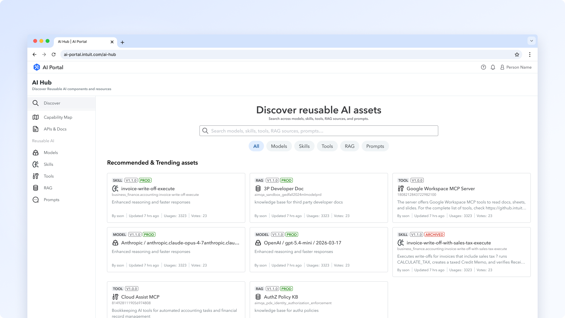
Skills foundry

The Problem

The platform shipped capabilities. Nobody could find them.

Skills β€” folders of instructions, scripts, and resources that agents load on demand to do real work β€” became the way Intuit packages agent capabilities. But the pipeline that produced them was invisible to anyone outside the platform team. Platform builders authored skills in IDEs, published them through a Jenkins step into a registry, and versioned them through DevPortal projects. Product teams downstream β€” TurboTax, QuickBooks, the orgs actually building customer-facing agents β€” had no way to see what existed, what their agent had access to, or how to wire it up themselves.

The result was a queue. Every product team filed a ticket with the platform team to get skills added, removed, or upgraded. Skills got chosen out of band, in Slack threads, by whoever happened to know what was available. The platform team became a manual approval surface for work the platform could automate.

The Approach

Three surfaces. One mental model.

I designed Skills as three connected surfaces in AI Workbench, each doing one job for the user β€” Discover a skill exists, Bundle it for an environment, Consume it from an agent. The same skill flows through all three without the user ever touching the underlying registry, Jenkins pipeline, or bucket policies.

The big constraint was governance. I couldn't invent a new permissions model β€” DevPortal already runs project access at Intuit, and reinventing it would create two sources of truth. So bundles inherit DevPortal project permissions silently. The trust boundary the org already runs on is the trust boundary the bundle inherits. No new admin surface, no extra access review.

Act 1 β€” Discover

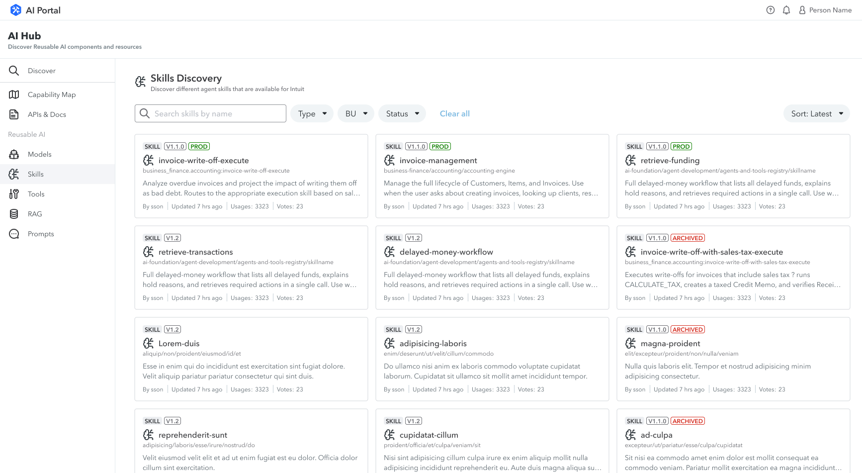
Skills Discovery catalog page in AI Hub with filter chips and skill cards
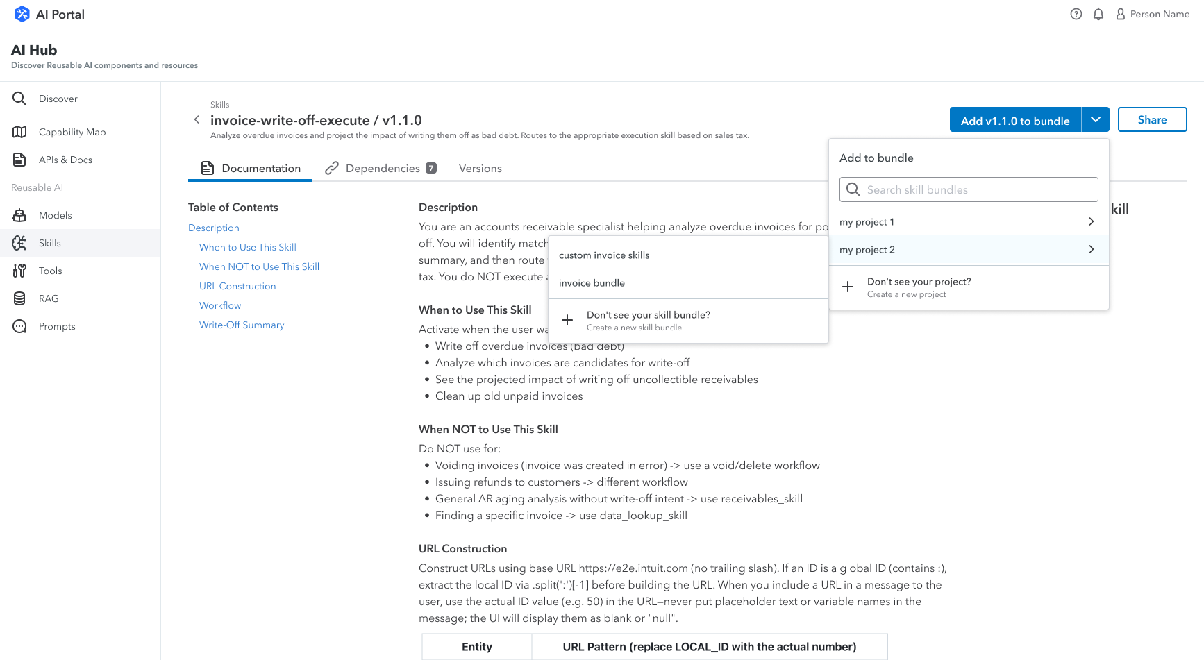
Skills details page in AI Hub with skill info

A catalog, not a registry.

The discovery page is where a builder asks the first question: does what I need already exist? The skill cards lead with the human-readable name and version, follow with a citymap-style namespace path (business-finance/accounting/accounting-engine), then a one-paragraph description of what the skill actually does. The filters β€” type, BU, status β€” match the way platform stewards think about skills, not the way the database stores them. Archived skills stay visible with a clear pill so nobody accidentally builds against something on its way out.

The sidebar is doing real work too. It's where I put the documentation links and the Slack channel for support β€” because the moment someone discovers a skill is also the moment they have the most specific question, and the answer shouldn't live three tabs away.

Act 2 β€” Bundle

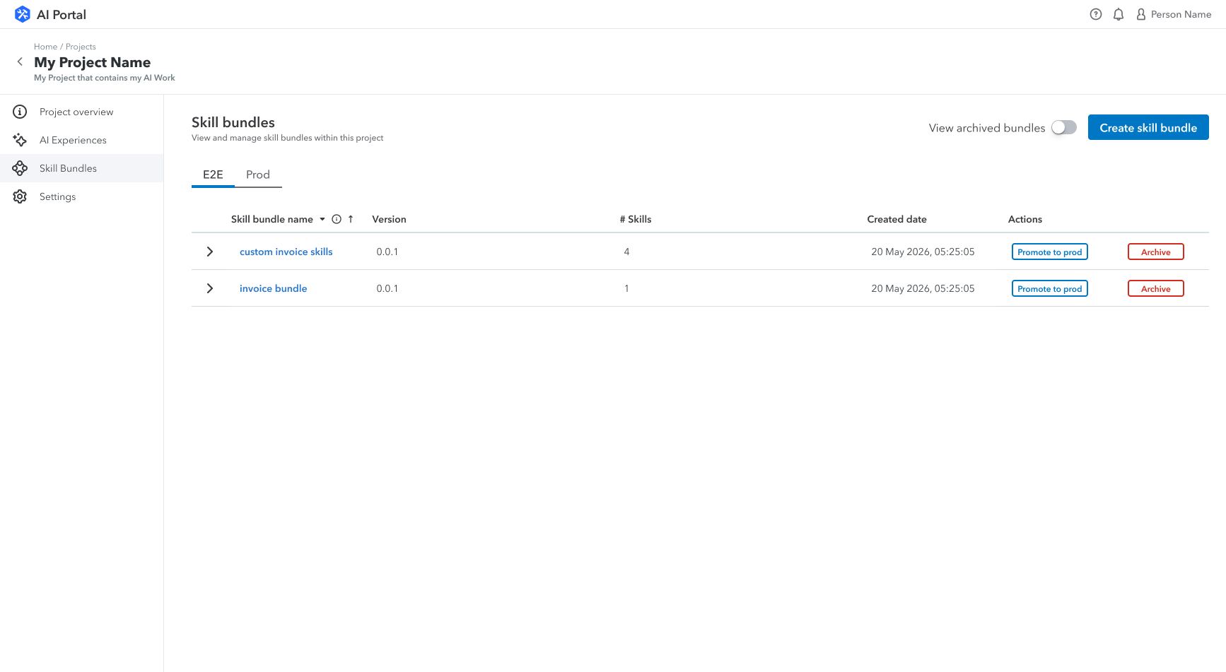
Skill bundles tab on a project page showing E2E and Prod environments with Promote to prod and Archive actions

Bundles live on the project. So does promotion.

A bundle is a versioned collection of skills attached to a DevPortal project β€” the same project that runs the agent that will consume it. So the bundle management surface lives on the project page, not on the platform-level Skills page. That single placement decision absorbs a lot of access-control complexity for free: if you can edit the project, you can edit its bundles.

The environment tabs β€” E2E and Prod β€” make the promotion model visible in the place builders already think about environments. Promote to prod is a per-row action, not a separate flow. Archiving a bundle is right next to it. The destructive action gets a red outline; the production-affecting action gets a primary one. Nothing about the system is hidden, but nothing requires a wiki to operate either.

Act 3 β€” Consume

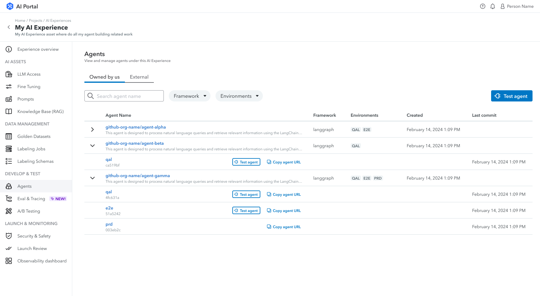
Agents page showing agents owned by the user and external agents, with environment tags and Test agent action

The agent is the last mile.

Once a bundle exists, the agent has to pick it up. The Agents page is where that happens: each agent in the project, the framework it runs on (langgraph in this view), and the environments it's deployed to as colored chips (QAL, E2E, PRD). The same vocabulary as the bundle page, in the same order, so the mental model carries over.

The split between Owned by us and External matters more than it looks. Product teams at Intuit consume each other's agents constantly β€” and historically nobody knew which agents were owned where, which made debugging anything cross-team painful. Surfacing ownership as a primary tab made cross-team dependencies legible. The Test agent action sits next to every agent so verification is one click from the row you're already looking at, not a separate page.

The Connective Tissue

Three surfaces, one cross-system collaboration.

The reason all three surfaces feel like one product is the alignment underneath them. Each skill knows what MCP tools it needs to call; each bundle knows what DevPortal project it lives under; each agent knows what bundle it consumes and what environments it ships to. I worked across three teams to make that alignment real β€” the skills registry team, the tools/MCP registry team (a separate org), and DevPortal stewards. The UI only works if those three systems agree on the model. The harder design work was that agreement, not the screens.

Live
Shipped in AI Workbench β€” the production surface for skills, bundles, and agents at Intuit
End-to-end
Sole designer across discovery, bundle governance, and agent management
3 systems
Aligned across skills registry, tools/MCP registry, and DevPortal β€” one unified surface

Reflection

Platform work has a strong pull toward designing what the platform produces β€” the registry, the pipeline, the version graph. But the people using the surface don't care about any of that. They want to know what exists, whether their agent can use it, and how to ship it. The cleanest thing I did on this project wasn't on any single screen β€” it was deciding that bundles belong on the project page, not on the Skills page. That single placement decision absorbed most of the access-control complexity for free.